Documentation
An overview of Nine, how to install and use, theme options and examples, and more.
An overview of Nine, how to install and use, theme options and examples, and more.
We would like to thank you for purchasing Nine!
This documentation file helps you to understand the whole theme concept and how it works. You should read all sections of the file before start your work. Here have multiple detailed explain of elements, theme sections and included video tutorials.
If you have any questions that are beyond the scope of this help file, please check out and search for Forum page.
After that you still can't find the solution yet, please leave a ticket on Support system then support agents help your issue.
Surely you have already installed WordPress on your server. If you don't installed it yet and you are new to WP and have problems installing it, you might want to check out following tips.
You need to download theme files after you've purchased the it. Following image describes downloads section of the item and you have 2 download choices.
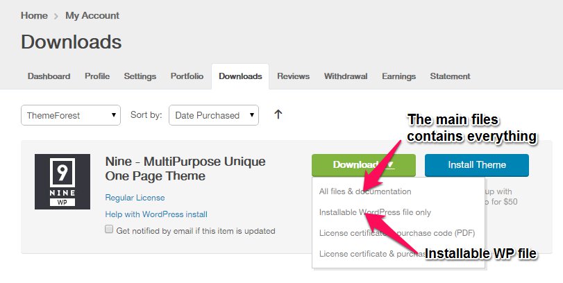
Downloading All Files gives you a all-files.zip file with all the content listed below
Downloading the installable WordPress theme only gives you the Nine.zip file.
You can either choose to upload the theme via WordPress upload function or via ftp to your site.
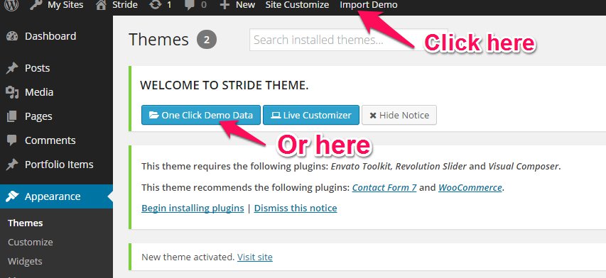
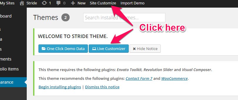
Appearance -> ThemesInstall Themes tabNine.zip file (it is located in the folder you've downloaded from ThemeForest).Install Now buttonwp-content -> themes directoryAppearance -> Themes of your dashboard and Activate the theme.After the activation you see this notice at top of your dashboard. This theme requires those three additional plugins and you need to install those.
Please click on Begin insalling plugins.
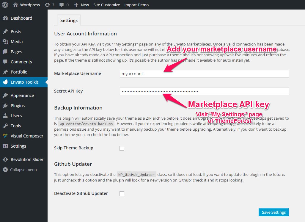
Envato Toolkit plugin requires MarketPlace username and API Key. You can get API key from your Settings tab of ThemeForest account. Lets provide those infomation and get theme update anytime and easily.
Theme has dedicated data option. You should click one of those link and select your desired home page layout. Action will set few important tasks including selection of Home page, Main navigation setting and Sidebar widgets when you click on Import Demo Data button.
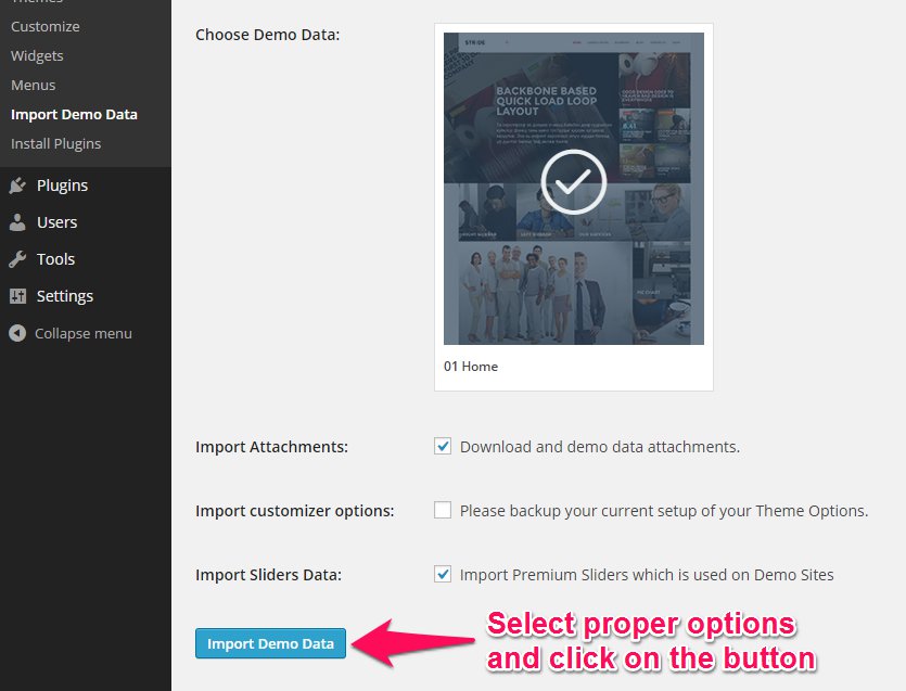
Please wait for a while until imports all the content.
Previous option helps you to include minimized demo content on your site reason for quick include. But you can have full demo data with regular XML data imports.
Please make sure you backup your existing theme folder before updating. Additionally we recommend performing the update on a development site before making it on your live site.
Hope you have provided your account information in Envato Toolkit plugin. If you go to the plugin page, you'll see similar to following image. Let's click on Update automatically link at right bottom. This is a most efficienat and easy way to integrate latest verion on your site.
After clicking to auto-update, you’ll see the confirmation that everything worked correctly.
Go to the Appearance => Themes and activate another theme than Nine such as TwentyTwelve, TwentyThirteen or Nine child theme. Delete the old version of the theme because folder name existing error comes up when we try to install it without deletion. Then install the theme again as you see early in this documentation.
Usually updating a theme means replacing the old files with the new ones. You can see changelog.txt file from the new download archive and you can get updated files list as modified/added and deleted. Upload and overwrite those files on your theme directory.
If theme changed lots of files and you really hard to collect changed files, there is a better way to do it when it comes to WordPress themes.
WordPress treats two version of the same theme as different themes. That is, if you have Nine v1.2 and v1.3 in your wp-content/themes folder they are treated as two different themes independent of each other.
That means you can have multiple version of the same theme installed on your blog. So whenever there is a new version of your theme available, instead of replacing or deleting the files of the older version follow this procedure.
The main advantage of following the above procedure is you can quickly switch back to the old version of the theme if you find any problems with the new version or if it clashes with any plugins you are using.
Live Customize panel has many options those help you to control your site. You have to know only where your desired options exist and how they are capable of. Please take some time to navigate through each tab and read options' description.
| Group | Class | Description |
|---|---|---|
General |
Primary color | The color that styles active menu, links & hover, pagination and much. But if the color doesn't fit for your area, you can set correct one at specific areas. Those customizations won't be overwritten by this. |
| Font: Heading | Please select your Titles, and meta texts font from 600+ google fonts. | |
| Font: Content & Body | Content text and small titles. | |
| Logo Image | Choose you logo image and see live result. If you think your logo image bigger at top, you can edit directly the image from media library popup. | |
| Logo Width | Don't you remember? Just click on your logo image and see the image details from media library. | |
| Retina Logo Image | x2 size of your original logo image. | |
| Favicon | 16x16, PNG/ICO/JPG | |
| Login Page Logo | up to 274x95px | |
Advanced | Header | |
| Header Height (px) | It increases header padding by difference between logo height and this value. But it doesn't show any result if you set lower value than logo height. | |
| Header Background Color | ||
| Menu color | ||
Page Title Area | ||
| Title Top Space | ||
| Title Bottom Space | ||
| Background Image | ||
| Title Background Color | ||
Content | ||
| Text color | ||
| Background color | ||
| Heading Color | ||
Footer | ||
| Enable Footer | On/Off | |
| Background Color | ||
| Footer Text Color | ||
| Sub Footer BG color | ||
| Sub Footer Text Color | ||
Post Types | Post Options | |
| Post Comments | On/Off | |
| Next/Prev links | On/Off | |
Page Options | ||
| Author Box | On/Off | |
| Page Comment | On/Off | |
Portfolio Options | ||
| Portfolio Label | Use this field to rename your portfolio custom post type. | |
| Portfolio Slug | Changes the default slug for this post type. | |
| Related Posts | On/Off | |
| Comment | On/Off | |
| Next/Prev links | On/Off | |
| Portfolio Main Page | Please select here main portfolio page. It's important for your breadcrumb. | |
| Portfolio Sidebar | You can set here default portfolio sidebar area. | |
Extras | Export/Import | |
Custom CSS | ||
| General CSS | ||
| Tablet CSS | Screen width between 768px and 991px | |
| Wide Phone CSS | Screen width between 481px and 767px. Ex: iPhone landscape. | |
| Phone CSS | Screen width up to 480px. Ex: iPhone portrait. | |
Widgets | You can add your widgets here to sidebars and footer columns. |
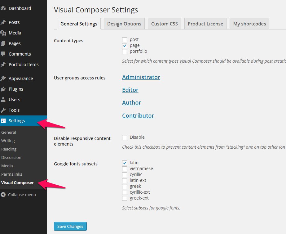
After the installation, you can configure something on following place for Visual Composer. You might want to allow VC for your custom post types initially.
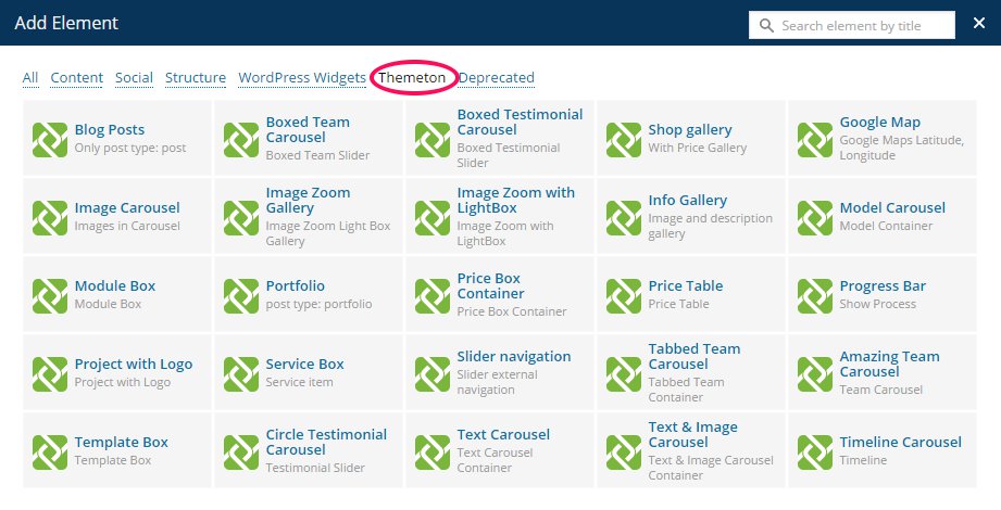
Visual composer has tons of elements that presents content view. But our theme has more advanced elements that enriches this beautiful theme. Please hit on the tab and find elements and use them for your need. Every element has a purpose and detailed options. You can see their live result on the demo pages. Enjoy :)
| Group | Description |
|---|---|
blog posts |
Show your blog posts by category and by specific numbers. |
boxed team container |
A container element. If you add more numbers elements of it's column/count, the element will automatically slide as carousel. |
boxed team | |
boxed testimonial container | A container element. If you add more numbers elements of it's column/count, the element will automatically slide as carousel. |
circle testimonial | |
extended tabs |
You can add more trasures on your tabs such as extra icon/image and sub title text. Also you can select 2 extra styles including Right navigation process and Service styles. |
gallery container |
A container element. If you add more numbers elements of it's column/count, the element will automatically slide as carousel. Regular gallery item presents only bullet style or tiles. But this element allows you to show your gallery as beautiful. |
gallery item |
A child element of the gallery element. You should add title and extra content for your specific images. |
google maps |
The element allows options for you to fill overlay coloured layer and custom map marker image. |
image carousel item |
Just a beautiful instance of gallery style. Allows you right left drag slide. |
image zoom gallery |
Image container element. |
image zoom light box |
Single image element but it's a child of Zoom gallery. |
info gallery item | |
info gallery | |
model container | A container element. If you add more numbers elements of it's column/count, the element will automatically slide as carousel. |
model | |
module box | |
portfolio |
Show your portfolio posts by category and specific numbers. |
price box container | A container element. If you add more numbers elements of it's column/count, the element will automatically slide as carousel. |
price box | |
price table | |
progress bar | |
project logo | |
service box | |
slider external navigation |
An advanced element that navigates nearest slideshow element. You can add multiple columns and background colors are inherits by primary color. |
tabbed team container | A container element. If you add more numbers elements of it's column/count, the element will automatically slide as carousel. |
tabbed team | |
team carousel | |
team item | |
template box | |
testimonial container | A container element. If you add more numbers elements of it's column/count, the element will automatically slide as carousel. |
testimonial | |
text carousel container | A container element. If you add more numbers elements of it's column/count, the element will automatically slide as carousel. |
text carousel | |
text image carousel container | A container element. If you add more numbers elements of it's column/count, the element will automatically slide as carousel. |
text image carousel | |
timeline carousel container | A container element. If you add more numbers elements of it's column/count, the element will automatically slide as carousel. |
timeline |
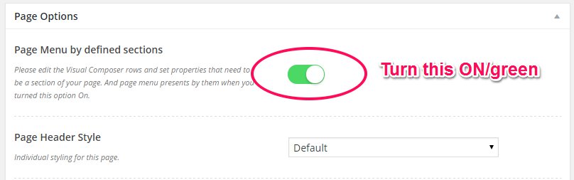
You'll find Page options at bottom of your main editor. Please read the option name and description and use them for customize your every single page.
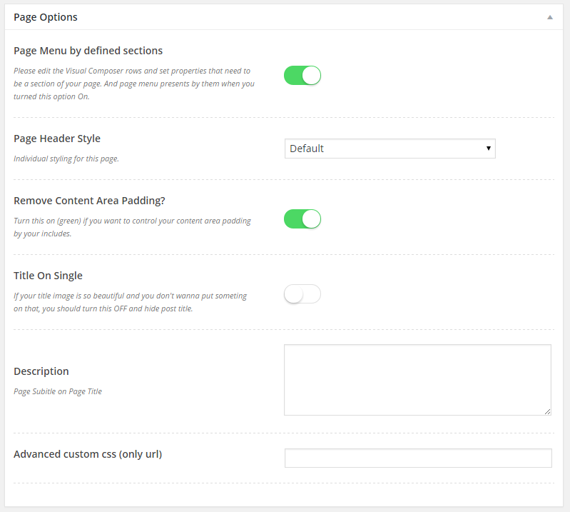
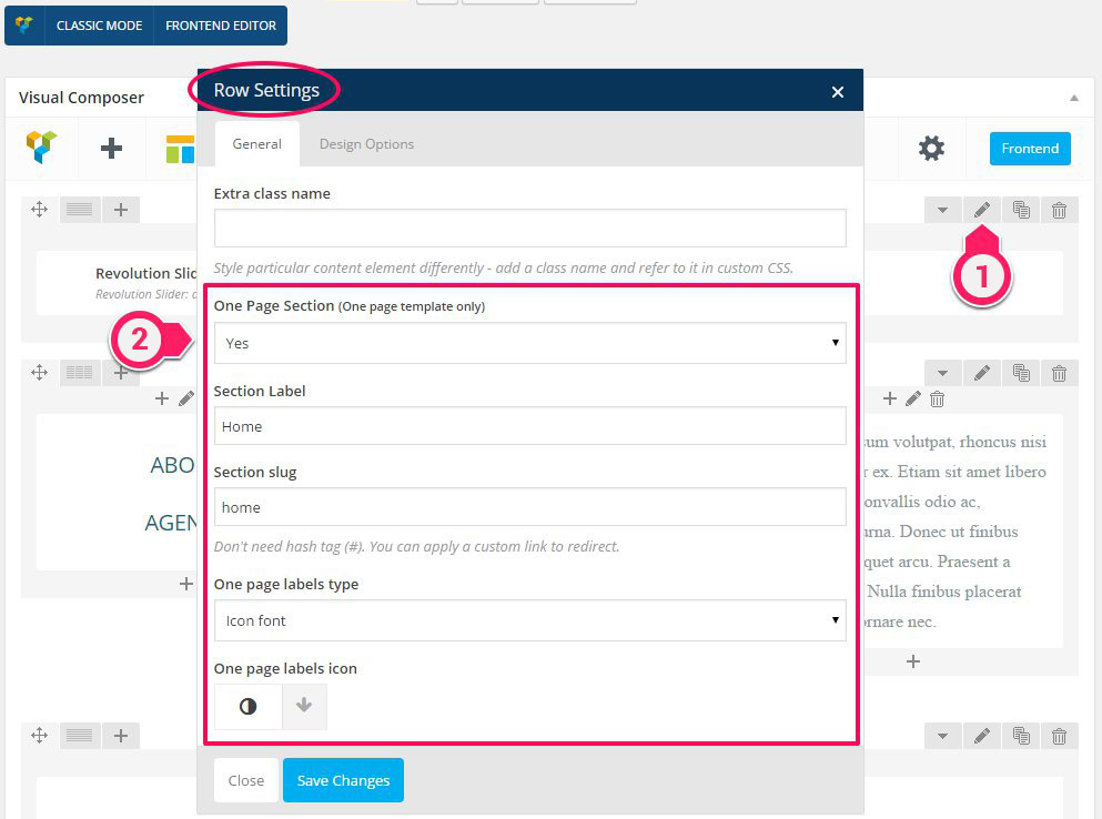
Please turn following option On when you want to use One Page style on your page. This option allows you to navigation replacement by your predefined row sections.
Then your should set your rows as a section of the page. Every included row (parent) sections have this feature and can be a part of one page section. Enable and set label and slug properties.
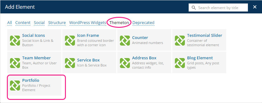
Theme has an additional element for your portfolio. You can make your portfolio page with it first by it's options including Column variations, Filter and Pagination options.
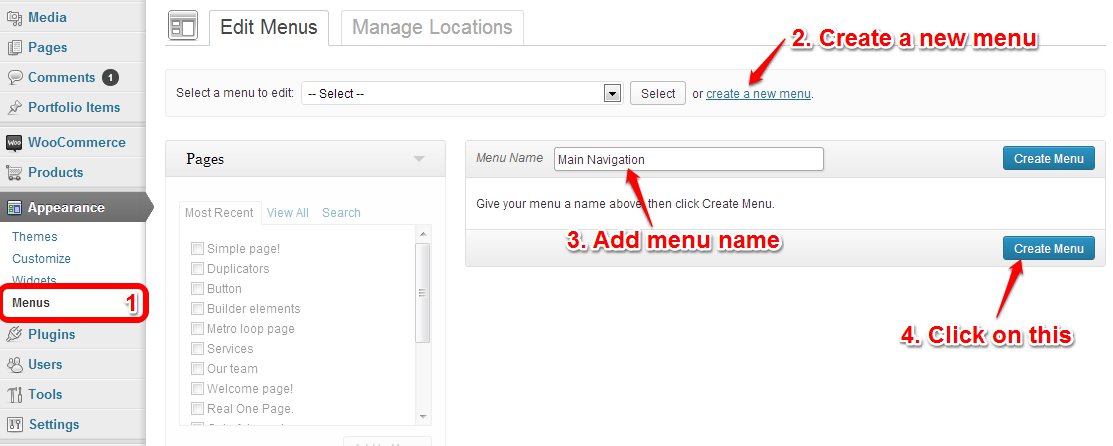
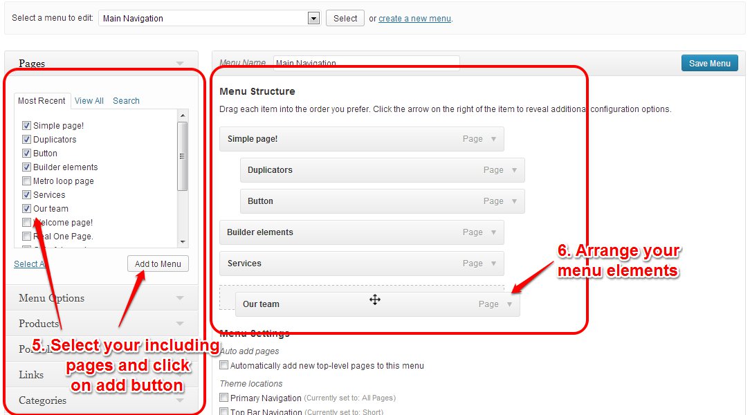
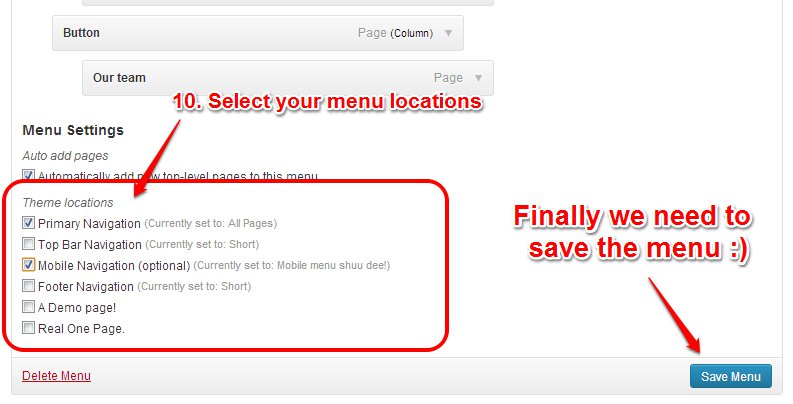
Menu system works through WordPress core functions. Then I hope you don't have any trouble with it. We extended menu options with a few options such as Menu Icon and Mega menu options. Please look at next images and follow the steps for your menu.
Hope you are familiar with this powerful slider. If you are not, please read some of important usages on the slider documentation file from documentation directory.
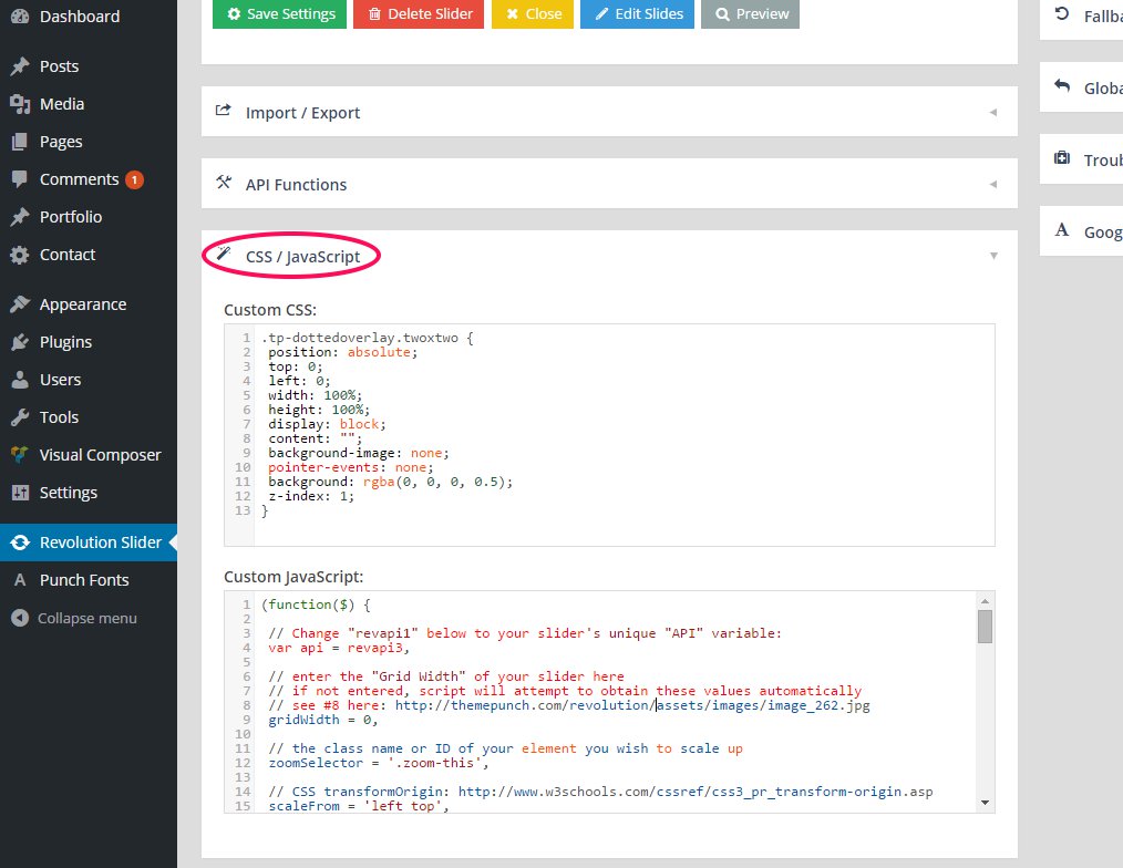
The slider has a tons of features and abilities. But we've added some more modifications related Navigation styling, Half transparent overlay etc on CSS / Javascript section of the Slider Settings.
Please import our sliders one by one or with One click options and check following.
Our theme is compatible with Contact form 7 and please put following markup on the Form field of your form. Then your form turns similar into our style that presents on Contact page.
<div class='contact-us'>
<div class='row'>
<div class='col-md-6 col-sm-6'>
      [text* your-name placeholder "Your name"]
</div>

<div class='col-md-6 col-sm-6'>
      [text* your-email placeholder "Your email"]
</div>

<div class='col-md-6 col-sm-6'>
      [text* your-subject placeholder "Subject"]
</div>

<div class='col-md-6 col-sm-6'>
      [text* your-tel placeholder "Contact phone"]
</div>

<div class='col-md-12 col-sm-12'>
    [textarea your-message placeholder "Message"]
</div>

<p>[submit "SUBMIT"]</p>
</div>
</div>
And you shoud add following template on Mail (message body) section then you'll receive all details to your mail.
From: [your-name] <[your-email]>
Subject: [your-subject]

Telephone:  [your-tel]

Message Body:
[your-message]
<div class="reservation-form clearfix">

<div class="input-reservation">
[text order-q class:date placeholder "18/05/2015"]
</div>

<div class="input-reservation">
[text order-q class:person placeholder "2 people"]
</div>

<div class="input-reservation">
[text order-time class:time placeholder "19:00"]
</div>

<div class="input-reservation">
[text order-name placeholder "Your name"]
</div>

<p style="text-align:center;"><button type="submit" class="reserv-submit">Submit <i class="fa fa-long-arrow-right"></i></button></p>

</div>
Mail (message body)
From: [your-name] <[your-email]>
Subject: [your-subject]

Order details: [order-q]
Order date: [order-time]
Order name: [order-name]

Message Body:
[your-message]
You can have subscribe form by MailChimp for WordPress plugin. Install the plugin and add a widget instance on footer sidebar area.
Sometimes hard to implement small css features by predefined options. Then we've prepared some helpful classes those can used on any custom places and style your content. Most of page builder elements have Extra class field and you can allow following classes on them.
| Class name | Description |
|---|---|
.brand-color |
Styles text color by current brand color |
.image-shadow |
Adds shadow on image element |
.text-white |
Sets text color as white |
.text-light | Sets text color as white |
.text-dark |
Sets text color as black |
.text-thin |
Sets text font weight 100 |
.text-thin-300 |
Sets text font weight 300 |
.hidden-xxs |
Hides element on lower screen. Smaller than 480px wide |
.text-center |
Text center |
.text-right |
Text right |
.text-left |
Text left |
.list-inline |
Allows ul/ol to inline style. |
.no-margin |
Disables element margin. Efficient usage is on Rows |
.no-margin-top |
Disables element margin top |
.no-margin-bottom |
Disables element margin bottom |
.no-padding |
Disables element padding |
.no-padding-top |
Disables element padding top |
.no-padding-bottom |
Disables element padding bottom |
Thank you to all who developed following projects/products. We really appreciate your support and time. We definitely couldn't do this template without you. We wish you all the best.
Special thanks to: